Misleading non-zero y-axis graph example
First published on October 28, 2010
In British Columbia Premier Gordon Campbell’s televised speech on October 27, 2010, one of the things he announced was a provincial personal income tax rate cut. This cut amounts to a 15 per cent tax reduction for incomes up to $72,000, effective January 1, 2011. This makes BC’s personal income tax the lowest of any province in Canada and is a substantial reduction. To illustrate his point, he used a few bar graphs, one of which looks like this:
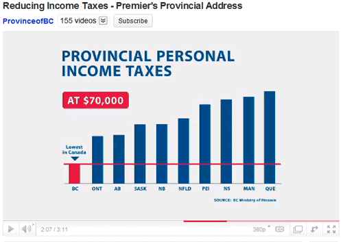
The graphs are basic and do not contain y-axis labels. In the graph above, it would seem that British Columbians’ provincial tax rates are about 2.5 times less than, or 40% the amount of the next highest taxed province of Ontario.
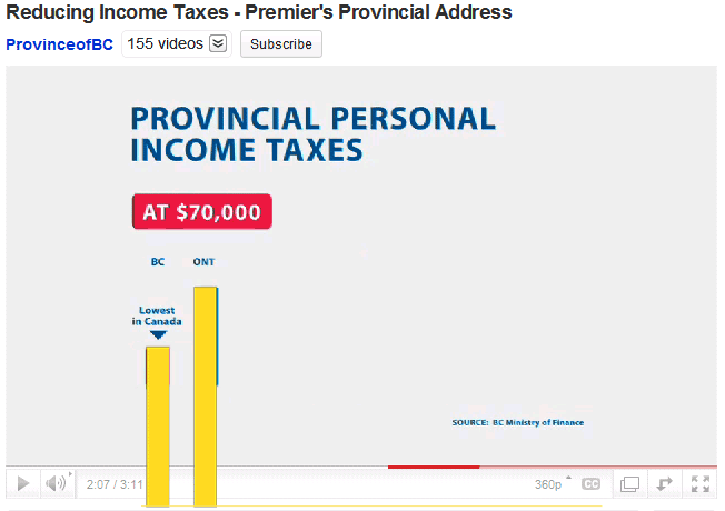
Using a simple provincial income tax calculator and entering the graph’s example income of $70,000, you get the following results for provincial income taxes: Ontario $4,500 and BC $3,900. Reducing the BC amount by 15% for 2011, you get $3,300. While this is not an exact calculation method, it gives you a rough idea of the actual numbers. The difference is about 1.36 times; put another way, BC’s provincial rate is about 73% of Ontario’s.
The main problem is that the bottom of the graph starts somewhere around $2,500 rather than $0, thus failing to provide the full picture. The horizontal red line further increases the perceived difference.
Putting these numbers on a 0-base y-axis, you can still see that BC’s rates are the lowest — and by a meaningful amount — but the difference is not magnified:
Non-zero y-axis graphs are widely used in the media and marketing efforts as an easy way to distort or sensationalize data. It’s interesting to see the government doing the same, even when it would seem like they didn’t have a reason to. It’s like they’re so used to playing spin doctor that they don’t know how not to.
To see all of the graphs, and the rest of the Premier’s address, check YouTube.
November 17, 2010 update: After all this fuss, the BC Government has now announced that they are cancelling the announced income tax reduction.
 Facebook
 Twitter
 Email this
 keung.biz. Hire my web consulting services at


October 29th, 2010 at 11:08 am
Julia says:
Great analysis
October 29th, 2010 at 9:27 pm
Melissa says:
I’m outraged that our politicians think we’re so dumb that they can just manipulate data any which way and we won’t notice. Thank you for putting it out there that they’re not fooling anyone.
October 30th, 2010 at 4:35 pm
Pacific says:
Good thing to point out, I didn’t know about that!
Trust a politician to use anything to his advantage!
October 31st, 2010 at 2:14 pm
Dominic says:
Well, misleading or not… It is still sad to constate that we are still the most taxed of all, here in Quebec :(… And even if we disagree with a lot of useless programs and everything, they still continue to burn our money like crazy…
 I’m one of the most loyal Québécois but I slowly begin to hate this place… :S
November 6th, 2010 at 4:31 pm
tian says:
I hate manipulation,,
good analysis bro, ^^